
Master Excel Charts: Pro Data Visualization in 2024
Focused View
56:52
1 -Introduction to Why we need charts.mp4
02:50
1 -Introduction to 2D column Chart.mp4
06:17
1 -Section 1 Question File.xlsx
1 - Practice file download.html
2 -Practicing 2D Clustered Column Chart and Customization.mp4
08:21
3 -Introduction to Stacked column chart.mp4
04:19
4 -Practicing Stacked Column Chart and Customization.mp4
09:32
5 -Introduction to 100 Stacked Column Chart.mp4
05:30
6 -Practicing 100 Stacked Column Chart and customization.mp4
07:34
7 -Section 1 Answer File.xlsx
7 - Answer File for Download.html
1 -Understanding Clustered 2D Bar and its options.mp4
04:03
2 -Understanding Stacked 2D Bar and its options.mp4
03:43
3 -Understanding Fully Stacked Bar and its options.mp4
03:41
1 -Conclusion.mp4
01:02
More details
Course Overview
Transform your data into compelling visual stories with this comprehensive Excel charts course. Learn professional techniques to create impactful visualizations, interactive dashboards, and custom templates that impress stakeholders and drive data-driven decisions.
What You'll Learn
- Create and customize advanced Excel charts for effective data presentation
- Build interactive dashboards with slicers and dynamic data ranges
- Select optimal chart types for different business scenarios
Who This Is For
- Data Analysts seeking advanced visualization skills
- Business Professionals needing impactful reporting
- Students and Academics presenting research data
Key Benefits
- Professional-grade chart templates for consistent branding
- Real-time data analysis with interactive elements
- Mastery of 2D, stacked, and clustered visualization techniques
Curriculum Highlights
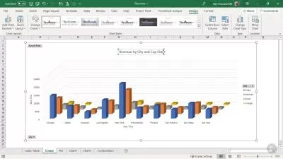
- Comparison Charts: 2D Column customization
- Advanced Bar Charts: Clustered & Stacked variations
- Professional Dashboard creation techniques
Focused display
Category
- language english
- Training sessions 11
- duration 56:52
- Release Date 2025/05/10